
The entire goal of your website is to attract new customers and keep current ones educated and interested. Not only do you need to drive traffic to your pages, but once people are there, you need them to convert into leads and clients.
If you search for “good site design” on Google, you’ll get billions of results, and most will agree that a strong call-to-action (CTA) is a necessity in your layout.
You probably already have CTAs on your pages, but are they the best they can be? Discover five main reasons why they may need to be stronger.
1. Direct Users Where You Want Them to Go
When users land on your page, they may spend a moment orienting themselves with your site. They will check out the navigation and scroll down the page, but what they really want to know is where to find the information that is pertinent to their particular situation. CTAs offer direction toward the content they need.
Your home page may include several CTA buttons as the start of your sales funnel. Each button directs the user on a different journey intended for that buyer persona. Think of your CTAs as the directional signage for your online presence. Just as you’d indicate where restrooms, sales, and checkout is in a brick-and-mortar store, you must shuffle users through your website.
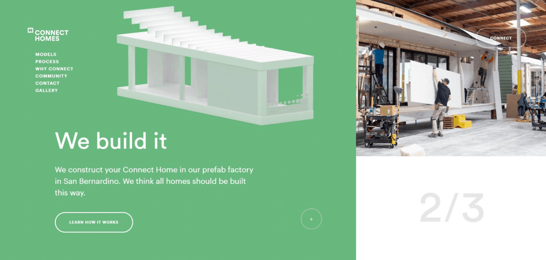
Connect Homes offers several CTAs on their landing page so that users can learn more about their product or connect with representatives. Note how, as you scroll down, the CTA changes from “find your connect home” to “learn how it works” to “why connect homes?” Each section of the main page highlights different types of information, depending on what stage of information gathering the person is in. Your website design should consider the buyer and every element of their journey.
2. Grab Attention with Placement
Where you place your CTA can make a difference in how engaged users are with it. You might think it would be best to place the CTA at the bottom of your page after the user has a chance to read through everything. However, people are impatient and often want to just sign up now for a newsletter or get to more information without reading sales copy.
It’s much more effective to place the first CTA above the fold and then another at the end of the page. You can have as many CTA buttons as you’d like, and they can all go to the same place. Offer opportunities to move forward in the purchase process.
3. Get to Know What Customers Want
Think about how your calls might speak to each buyer persona. Most businesses have more than one customer type. Each person has a different pain point or problem they need solving. Your action commands should reflect the solution to each pain point. For instance, you might offer several types of solutions or ways to resolve numerous issues. Incorporate those fixes into your webpage design.
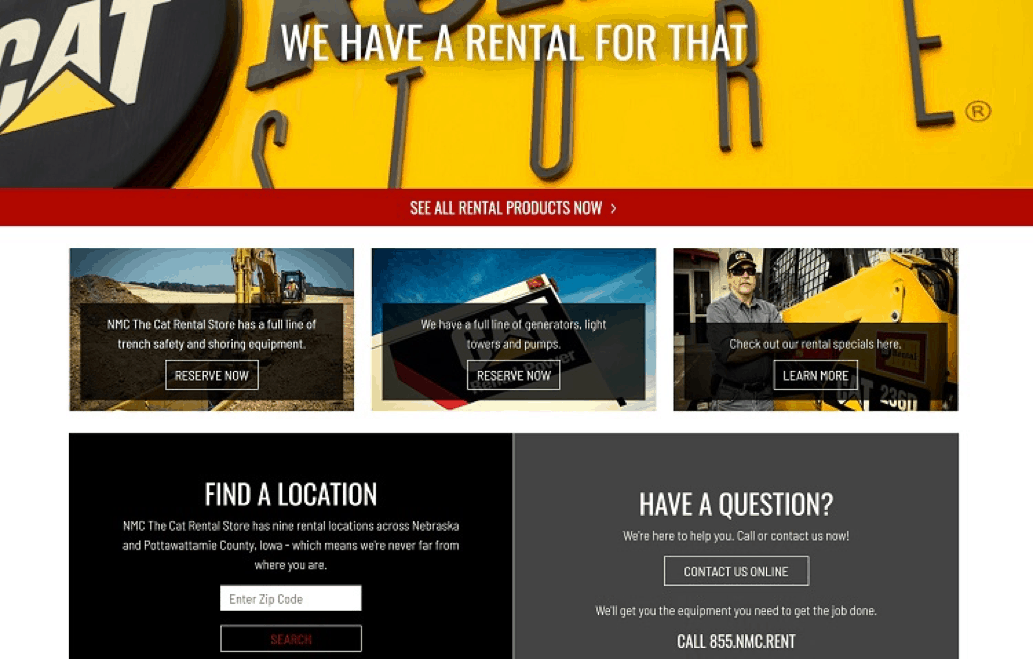
NMC CAT Rental Store does an excellent job of breaking their directions into categories that speak to each buyer type. Note how they highlight the ability to reserve trench safety, shoring equipment, and generators. They also showcase how users can get deals via their special offers. No matter the budget or the need, they have an area on their site addressing each point.
4. Declutter Your Page and Find Your Focus
A strong CTA should be the highlight of your landing page. You don’t need a lot of needless information. Everything should point the user toward the response you’d like from them. If anything doesn’t move them through the sales funnel, then cut it.
Your CTA buttons should stand out from the rest of the page, so make sure you design with contrast in mind. Choose a color that pops on the page and grabs attention. Think about your headlines, images, and content. Everything should move toward a conversion.
5. Engage Customers and Keep Them on Your Site
You can use your calls-to-action to keep customers engaged and interacting with your site. People live hectic lives in the 21st century, and it’s easy for the typical site visitor to grow distracted and leave without completing a form or cart. Anything you can do to keep them looking at your page, and moving through the process helps with your overall conversion rates.
You can find many ways to engage customers, including using videos and interactive or animated elements. Which one works best for your customers depends on your audience, so try different methods and see what your crowd responds best to.
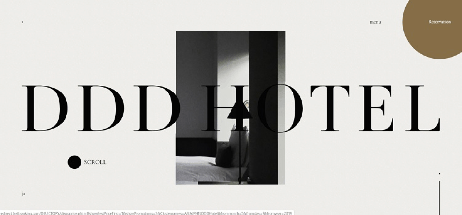
DDD Hotel in Japan has a highly interactive site that keeps users interested. When the mouse hovers over the word “Reservation” in the upper right corner, the box turns into a circle. The animation highlights the button does something and also encourages the user to move their cursor over the element.
Test Different Looks and Build Strong CTAs
If your CTAs still aren’t performing the way you’d like, spend time conducting split tests. Try different colors, placement, wording, and anything else you can think of that might make a difference. The more analysis you do of your site, the better you’ll understand how your visitors respond. And if it’s just not your cup of tea, you can always hand it to the pros and look for web design San Francisco.