As a kid, whenever I went to McDonald’s, I used to get excited about three things. No, being excited about getting a happy meal was not the first thing.
The first was their logo.
How can something as big as McDonald’s put so little effort into their logo? Just two curved strands that make a yellow ‘M’ placed on a red board that reads ‘McDonald’s’. Nothing else!
Need a #logo that will convert? This article can be your step-by-step guide for creating it!
Why didn’t they put more thought and effort into it? Well, it turns out they did.
Not only did they put a lot of thought into their logo, but there is also a whole science behind it. It led me to discover ‘Ketchup and Mustard Theory’.
Red as a color tends to stimulate us and make us feel excited and energetic. Yellow symbolizes happiness, cheer, and youthfulness. Together, they make ‘Ketchup’ and ‘Mustard’. This is the rationale behind the logos of most fast-food joints.
Here is an activity: From the image below, circle the logos of food joints that don’t feature red or yellow.
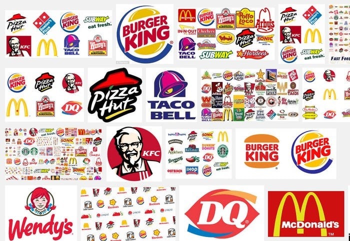
One, maybe two. That’s it. All others have either of the two colors.
The popular adage among the chef community goes: ‘You eat with your eyes first’. It is no surprise food companies go to lengths to make their logo stand out.
That is enough to tell you about the importance of the logo and why having a professional logo design is crucial.
So, how do you go about it? Where to begin? This blog post will walk you through the entire process.
Conception
The journey of any logo begins with conception. Here, you have to get a clear perspective on two things about your brand’s message:
- What to say
- Whom to say
The ‘what’ part is the message you want to give. Do you want to be sophisticated or cheeky? Should the message be hard-hitting or toned-down?
The ‘whom’ part is your audience. If you’re a beauty brand, your target audience is feminine. If you’re providing health insurance, you’re targeting families. For a food joint, you’re cutting across the gender divide.
Once you are clear about your message and audience, you can be sure that the final product will be as you thought.
After conception, you then need to follow the rule of S.M.A.R.T:
Simple: Your logo should be simple. Try adding as few elements as possible. After all, minimalism is cool.
Memorable: It should have some distinct qualities to make it unique. For example, if you’re keeping an apple as your brand’s logo, why not bite a part of it off.
Ageless: Your logo should be timeless. It should have the qualities to survive across eras and even generations.
Reliable: The logo has to be scalable to be reliably used across different platforms, mediums, and dimensions.
Thoughtful: Every element of the logo should be well thought out to espouse your brand identity and symbolize your brand’s purpose and usefulness.
Style
A few days ago, Xiaomi, a Chinese electronics company, unveiled its new logo. The company changed its logo from this:
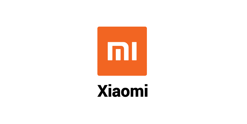
To this:
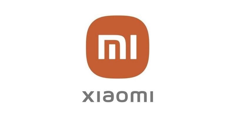
They paid a designer millions of dollars to change their logo from square edges to round edges.
People laughed it off. For them, it is too insignificant of a change to even bother with. But there is a whole science behind it.
The designer Kenya Hara explained that the inspiration for changing ‘square’ to ‘round’ is the concept of ‘Alive’.
Therefore, it’s not a mere change of shape but an encapsulation of the brand’s inner spirit. The designer studied both shapes extensively, derived a mathematical equation, and then came up with a new design.
This process tells you the importance of minute details in a logo. No element is too small to ignore. The most significant element is the look of your logo. Here are the types of logos:
Text-only
A text-only logo works if you have a small business or a single dedicated product. It is the best way to establish your brand identity and improve brand recognition. Since your name is your logo, people instantly recognize the brand.
Beverage, read (Coca-Cola)
Initials/letter mark
Initials and letter marks are used if your brand has a long name or more than one word. The initials become the brand identity. So much so that the full name is forgotten by the people.
Try saying ‘I bought a Hewlett-Packard printer’ instead of ‘I bought a hp printer’, and you’d know the difference.
Icon
An icon is used if your business can easily be described by a picture without confusing the viewers. The icon can be anything from a symbol or an image, to an abstract design.
Take the example of Twitter. It is a microblogging website where people can voice their opinions freely. The bird in Twitter’s logo encapsulated this idea.
According to Logaster, the bird reflects the essence of online microblogs:
- ‘Twitter’ sounds a lot like ‘tweet’, which is a sound made by birds
- A bird symbolizes freedom and endless possibilities
- Short messages are delivered as fast as birds fly
Emblem

No, you don’t have to be Harvard University-years-old to use an emblem as a logo. Emblem have tradition attached to them; that’s why they are used by educational institutions, government organizations, and defense agencies.
Colors
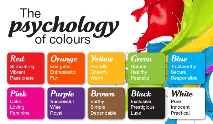
The colors of a logo are the first thing that catches the eye of viewers. They have a significant impact on how we recognize a brand and our buying habits.
According to research by WebFX, 85% of customers say color is the primary reason they buy a product. 80% say color increases brand recognition.
The use of colors also depends on your target audience and brand personality. According to Forbes:
- Red is a color that means youthful and exciting.
- Orange represents confidence and is seen as cheerful or friendly.
- Yellow means clarity, optimism, and warmth.
- Purple is wise, imaginative, and very creative.
- Green means growth, health, and peace.
Also, different shades appeal to different people.
According to KISSmetrics, women prefer lighter shades, while men prefer darker colors.
So, before choosing a color, you have to decide:
- What gender are you predominantly targeting?
- What kind of message do you want to give (dark color for hard, light shades for softer tone)?
- You want a monochrome or multi-color logo
If you’re confused about the color palette, you can seek the help of a design company like Logo Design Valley. These companies have professional designers who can come up with the perfect color schemes that go with your brand identity and messaging.
Final words
Designing a logo is not a cakewalk. You have to really dive into the process. It’s a long process, where you experiment several times before coming up with a perfect logo.
Whatever one might say, sometimes starting with your logo can become a mare’s nest. You just can’t start with it.
In a situation like this, it is totally fine to seek some ideas or inspiration. You have forums like Pinterest and Google Design to scour through millions of designs. You can get ample ideas to set you off on the path of designing your own stunning logo.

