A website makes your business look more professional. You can use it to pull in new leads, distribute information, and make an excellent first impression. People expect most companies, even local ones, to have a website.
The average consumer expects to pull up information online, with around 97% turning to the internet to research local businesses. Unless they already know your company, you risk missing those potential leads without a website.
Just having a #website isn’t enough, though. You need something that meets users’ needs and presents your #business in the best possible light.
We’ve found that the best way to learn how to create an audacious web design is by studying truly stellar examples. We’ve come up with five amazing examples that embrace some of the key components any site should have.
1. Side Scrolling
One trend we’ve seen recently in a lot of different designs is horizontal scrolling. Rather than going down the page, the user moves the mouse, and the page scrolls to the left. This also works particularly well on mobile devices with the swipe feature.
![]()
Nieuw Bergen Iconic Living features modern apartment communities in Eindhoven, Netherlands. What we love about this design is the way the images rotate in and scroll to the side. Each image has a “Read More” button so you can learn about a particular building.
A horizontal scroll of images works particularly well for websites focused on fashion, home builders, and any other place you’d like to feature photos of your work.
2. Relevant Photos
You have just a few short seconds to make an impression on your site visitors. The aesthetics of your site mean the difference between someone hanging around or bouncing away to a competitor. Choose professional-quality photos and utilize them for your hero images and in product descriptions.

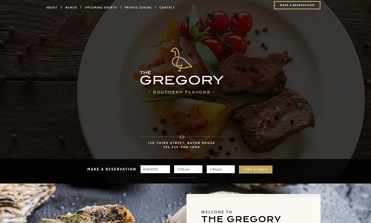
The Gregory fills the screen with an image of one of their mouth-watering culinary creations. After a few seconds, the picture changes to showcase another dish. As you scroll down the page, you see additional images of oysters and diverse cuisines. If you leave the page without feeling hungry, you’ve missed the point.
3. Amazing Headlines
If you choose a minimalist design to place the focus on the calls to action (CTAs), you’ll need headlines that grab attention. The best headlines address the problem a potential customer has. What drove them to your site in the first place?
Ideally, headlines should be short and to the point. But even the typography you use and the placement of your H1 and H2 headers can lead a user through your site or drive them away.

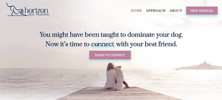
Horizon Dogs keep their overall design simple. The focus is on the headlines and the message. They understand the pain point of their target audience. They address that need and explain how they can fix issues dog owners might have.
They use a simple serif font, but they use a large size, and they highlight the word “connect” with a blue accent. The design is simple and to the point, but also elegant and eye-catching.
4. Asymmetrical Layout
For many years, designers stuck to a grid-style layout. However, today’s designers experiment with all types of looks, including overlapping pieces, non-square shapes, and architectural-inspired designs.
Do make sure any unusually shaped elements look okay on a smaller screen. The last thing you want is a website that doesn’t work well for your mobile users.
With more and more people using their smartphones to access the internet, you could alienate half your audience if your site isn’t mobile-responsive.

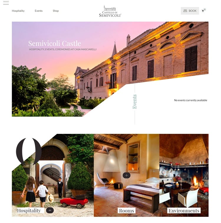
Castello di Semivocoli showcases beautiful images of the estate by adding images with various angles that highlight the beautiful architecture and gorgeous vineyards. The site has a highly luxurious feel, which attracts the guests most likely to book an event or stay with them.
Note how the outline of their castle matches the general shape of the photos. It’s a brilliant design that pulls the user in and makes them continue scrolling to see what unique design element they’ll find next.
5. Animated Elements
High-speed internet is no longer an elusive dream. Even rural communities have faster internet than ever before. With the introduction of 5G networks and fiber optic cables, people can pull up videos in seconds.
Adding some elements with animation grabs users’ focus. You can move an object to where you want the user’s attention directed, for example.

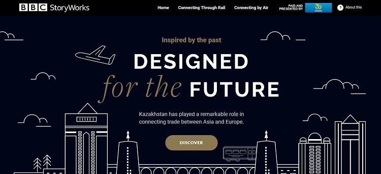
BBC Storyworks came up with an inspiring animated design that is simple yet complex at the same time. The colors are monochromatic, using only black and white with a touch of dark gold. The outline of buildings looks like a very primitive sketch.
They then animate a few clouds, an airplane that goes toward the upper left corner of the screen, and a train moving just under and behind the CTA button. The animation draws the eye to the action they want the site visitor to take.
What Designs Do You Love?
One of the best ways of finding elements you’d like to use on your own website or having an investment firm website design is by taking note when you stumble upon a look you love. Note what makes each stellar design work. You can then implement the ideas that would speak to your customers. A website is a living entity that must change and adapt as your business grows.

