
Advice on the color palette you should use for your website is all over the place. While it makes sense, in theory, to use your brand colors for your online presence, the reality doesn’t always mesh. It’s good to offer consistency across different mediums and even online and offline methods, but what happens when your colors don’t translate well?
Goal of your #site should be to engage visitors #visually, #intellectually, and through #features. Read this article and learn more about this topic.
In the most recent State of the Connected Consumer report, researchers surveyed over 15,000 consumers worldwide. They found approximately 61% of people plan to spend more time online post-pandemic than pre-pandemic. More time online means more opportunities to interact with your brand’s website. Design is more crucial than ever before. More time online means more opportunities to interact with your brand’s website. Website UI/UX design is more crucial than ever before.
Your brand colors are likely the thing that has the most powerful first impression on the site visitors. The brain processes the hues in a millisecond and taps into underlying emotions.
How can you know if your brand colors work for your business-to-business (B2B) site? What colors should you use for your website? Here are some things to keep in mind as you tweak your design and your hues.
1. Consider the Audience
Different people appreciate color in different ways. Black might be seen as severe and established in one country and a harbinger of doom in another. Know your audience, what their beliefs are, and how different shades impact them.
Once you fully understand your audience, create buyer personas and look at the psychology of your color choices. Even the gender of your customers can impact whether they like blue or green better.

The seventh TV captures moving images. Many of their shots are filled with vivid red, yellow and blue. So, they stick to a black and white color scheme attractive to men and women of all ages. They then add a gallery of images with pops of color to showcase the quality of their work.
2. Ask How Recognizable You Are
How long has your brand been in business? Companies such as McDonald’s are known for their golden arches. Even though yellow doesn’t always translate well online, they had to figure out a shade that worked for their website and mobile app, reflecting those arches people are so familiar with.
If you’re just starting, it’s much easier to change your color palette or create a website with different colors. Think about how recognizable the hues you’ve used are and if you should change them or not.
3. Make Things Transparent
Perhaps you have a color scheme in mind, but elements aren’t meshing well. Fortunately, you can always add some layering and transparency to help everything work together. Sites with a monochromatic look may appear a bit plain without the addition of some animation or openness, for example.
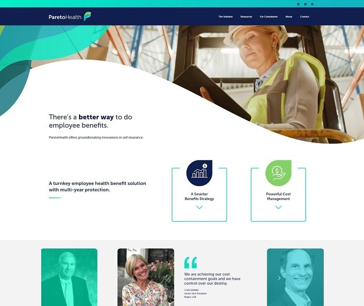
Pareto Health uses several shades of blue as accents. The hues range from a vivid aqua to a deep navy. Note how they add some transparency, so the video playing in the hero image shows through the swirl to the left slightly. The result is striking and grabs user attention from the minute they land on the page.
4. Test Several Options
If one combination doesn’t work on a screen, try adjusting the shading slightly. You can add a bit of green, red, or blue and come up with a completely different hue. You may want to stay in the same color family but tweak things, so they pop on a computer screen.
Test your color choices on both desktop and mobile devices. Over half of internet users get online via their smartphones, so make sure your site looks good on a mobile device, too.
5. Utilize Accents
Another idea is to use your brand’s color palette but adds a pop of color for your call to action (CTA) button, underlines, and accents. Just because your brand is known for royal blue and yellow doesn’t mean you can’t add a pop of orange to grab user attention. You can remain true to your company’s personality but still use color to engage buyers effectively.

Save a Child’s Heart uses pink and blue to show they are helping young children live when they otherwise wouldn’t. The organization uses a pop of red to draw attention to the “Donate Now” button. Red also happens to tie into heart health awareness. You’ll also see a sunny yellow here and there throughout the site.
6. Limit Colors
While a bit of color here and there can draw the eye and encourage people to take action, too much color distracts users. Limit your color choices to two or three. If you have more than that on your page, you should get feedback from users and make sure it doesn’t look like a color explosion.
You’re working with other businesses, so adding in a rainbow may make you seem a bit childish and unprofessional. Consider which colors get your message across the way you wish.
7. Try Something New
Don’t be afraid to try something unexpected. If everyone in your industry uses blue, there may be a reason, but can you use something equally effective? The only way you’ll be able to tell what colors your audience responds to is by trying different options and conducting A/B tests. Which ones perform best?
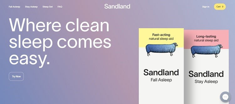
Sandland uses soft pastels for a soothing effect that makes one thing about snuggling under the blankets and getting a bit of extra sleep. The look meshes perfectly with their product. Note the background color with its lilac and pink ombre effect. The two products feature a blue ewe, but at the top is a pastel yellow and soft pink.
Do Your Colors Work for Your B2B Biz?
Only you can answer whether or not the colors help convert browsers into buyers. If something isn’t working, try a different tactic. Change one thing at a time, adjust the shade a tiny bit and see what helps most.
With a bit of trial and error, you’ll develop an aesthetically pleasing and emotionally powerful design.
Eleanor Hecks is editor-in-chief at Designerly. She was the director at a marketing agency before becoming a freelance web designer. Eleanor lives in Philly with her husband and dog, Bear.